
Professional Color Box: Transform Your Product Packaging with Vibrant Custom Designs
2026-09-26
Your product deserves more than a plain brown box. In a split second, color, shape, and finish decide whether a customer picks you up or scrolls past. That’s where professional color boxes come in—and why Kuaijie Carton focuses on vibrant, custom designs that stop the scroll and start a conversation. This post explores how bold packaging choices can elevate your brand, protect your product, and turn every unboxing into a mini marketing moment.
Color Psychology Meets Shelf Appeal
On a crowded shelf, color is the first thing that cuts through the noise. Warm reds and oranges trigger urgency and appetite, which is why snack brands lean on them heavily, while cool blues and greens signal calm and health, pulling shoppers toward wellness aisles. It's not just about being bright—it's about matching the emotional temperature of the product with the mood of the buyer in those first two seconds of scanning.
Designers often think of shelf appeal as a fight for attention, but color psychology works more like a quiet conversation. A muted, earthy palette can make an organic skincare line feel like a trusted ritual, even before the label is read. The trick is contrast with neighboring products: a matte black bottle among pastel competitors stands out without shouting, while a single vivid accent color can guide the eye exactly where you want it.
Ultimately, the goal isn't just recognition—it's resonance. A palette that aligns with the product's promise creates an instant, almost subconscious shorthand for the shopper. Whether it's the golden warmth of a honey jar evoking natural sweetness or the crisp white and silver of a tech gadget implying precision, color turns a passive glance into a reach for the shelf.
Custom Artwork That Feels Hand-Drawn, Not Stock
There's a dead giveaway in most stock art: every line has been smoothed to the point of losing its pulse. The hand behind the image disappears. That's exactly what we avoid. Every custom piece starts as an actual drawing—pencil, ink, even charcoal smudges—and then moves into digital only for final cleanup. The little inconsistencies stay. A line that thins out too quickly, a brush edge that isn't perfectly filled. Those are the details your eye trusts.
Send us a messy napkin sketch, a photo of a textured wall, a torn piece of paper you like. We'll take that and build the artwork around it, keeping the roughness where it matters and pushing the composition until it holds together. You won't get back something that looks like it was pulled from a download button.
The goal is simple: make it feel like an artist sat down and made it for you. Not like you picked the closest option from a set of ten.
Cardboard That Can Take a Beating
Most people hear "cardboard" and picture a flimsy box buckling under a stray elbow. This stuff flips that assumption on its head. We tested it by stacking weights on unsupported spans, dropping filled cartons from loading-dock height, and dragging edges across concrete. The board held its shape without the usual crease-and-tear drama.
The trick is in the layered fiber orientation. Instead of running all the corrugation the same direction, the inner flutes alternate at tight angles. That distributes impact energy sideways through the sheet instead of letting it punch through one weak line. A water-resistant starch binder adds just enough stiffness without making the board brittle.
For anyone shipping heavy or oddly shaped items, that means fewer crushed corners and less need for double-boxing. You can reuse a single carton through several trips before the edges start to soften. It still looks like ordinary cardboard, which keeps packing simple, but it behaves more like a lightweight structural panel.
Ink, Gloss, and Everything In Between
Gloss rarely gets the credit it deserves. A high-shine coating can make blacks deepen and colors vibrate, but it also hands every fingerprint a stage. The moment you pair a dense ink coverage with a gloss laminate, the surface turns reflective enough to challenge your lighting setup. It is not simply shiny versus dull; it is about how the coating changes the way ink sits, dries, and catches the eye at different angles.
Between full gloss and dead matte sits a wide middle ground of satin, soft-touch, and scuff-resistant finishes. Each one shifts the perceived weight of a printed piece. Soft-touch can make a brochure feel quieter and more deliberate, while a satin finish keeps colors readable without the glare. The trick is matching the finish to the content rather than defaulting to whatever the printer stocks.
Ink itself often behaves differently across these surfaces. A porous uncoated sheet will drink ink and mute contrast; a sealed gloss sheet holds pigment on top, boosting saturation but also exposing every band or uneven layer. Testing on the actual stock matters more than any spec sheet. Once you see how a rich blue moves from deep and velvety on matte to almost electric under gloss, the phrase everything in between stops being filler and becomes a real production decision.
Recycled, Not Downgraded: Eco Luxe Boxes
The line between recycled and refined used to be easy to spot—rougher textures, duller surfaces, a box that felt like a compromise before you even lifted the lid. These eco luxe boxes flip that assumption by starting with high-grade post-consumer fibers and shaping them into rigid, smooth panels that hold their form under pressure. The result is a container that doesn't whisper "recycled" as an apology but presents it as a deliberate choice.
Details matter more in this category than anywhere else. Instead of relying on heavy coatings to hide imperfections, the manufacturing process presses fibers into a dense, even surface that accepts subtle embossing, foil stamping, and edge painting without cracking or warping. The corners are reinforced, the interiors lined with unbleached cotton or recycled silk, and the magnetic closure snaps with the same quiet confidence you'd expect from a watch case or perfume coffret.
Brands that adopt these boxes aren't just checking a sustainability box—they're giving customers a reason to keep the packaging long after the product is gone. A jewelry tray, a keepsake case, a drawer organizer: the second life of an eco luxe box extends the story past the unboxing moment. That's the real upgrade: not louder gloss, but a quieter, more considered kind of luxury.
The Unboxing Ritual Your Buyers Crave
The moment a package lands on a doorstep, anticipation starts building before the tape is even touched. A plain cardboard box can feel forgettable, but subtle details like a branded seal, a single sticker placed at the seam, or an inner wrap in a distinct texture immediately shift the mood from routine delivery to personal ritual. These small choices don't need loud logos or extra filler; they simply give a buyer a reason to slow down, notice the layers, and feel that someone carefully prepared this for them.
What makes unboxing memorable is rarely the product alone but the sequence of small discoveries. A short note printed on thick paper, a reusable pouch instead of plastic wrap, or a neatly folded tissue sheet can all create a gentle pause between opening the outer box and reaching the actual item. This pacing helps buyers savor the experience and often leads them to photograph or film the process without being asked. The best unboxing moments feel almost private, like unwrapping a gift from someone who knows exactly how you like things presented.
Rather than chasing elaborate packaging that ends up in the trash, focus on one or two tactile surprises that reinforce your brand's character. It could be a hand-stamped interior pattern, a single sprig of dried lavender tucked inside, or a small card with care instructions written in a conversational tone. These details turn a routine delivery into a small ritual buyers want to repeat and share, not because they were told to, but because the experience genuinely felt worth remembering.
FAQ
A professional color box is built around your brand's visual identity rather than using generic templates. It incorporates full-color printing, precise structural design, and high-quality materials to create a container that feels intentional. The result is packaging that protects the product while also communicating care and attention to detail, which can influence how customers perceive the value of what's inside.
Absolutely. You can supply your own vector files, photographs, or hand-drawn concepts, and the design team will adapt them for the printing process. If your artwork needs adjustments to fit the box dimensions or to ensure colors reproduce accurately, those refinements are handled as part of the production workflow. The goal is to keep your branding consistent across every surface.
Start by measuring your product's length, width, and height, then add a small buffer for protective inserts like foam or corrugated partitions if needed. The box can be die-cut into custom shapes beyond simple rectangles, such as sleeves, trays, or gable styles. Sharing photos or a sample of your product with the packaging team helps them recommend a structure that balances snugness with ease of unboxing.
The most common method is offset printing, which delivers rich, consistent color across large runs. For shorter quantities or variable designs, digital printing offers flexibility without sacrificing brightness. You can also add spot UV coating, foil stamping, or embossing to make specific elements pop. The key is to choose a finish that complements the color palette rather than overwhelming it.
Minimum quantities vary depending on the printing method and box style. Digital printing often allows runs as low as 50 to 100 units, while offset printing typically requires a few hundred boxes to be cost-effective. If you're still testing the market or need a small batch for a product launch, ask about hybrid approaches that combine short-run flexibility with premium finishes.
Yes, many suppliers offer recycled paperboard, FSC-certified stock, and soy-based inks that reduce environmental impact without dulling the colors. You can also request water-based coatings instead of plastic lamination. Be sure to specify your sustainability goals early in the design process, as this can influence material thickness, ink coverage, and the type of adhesives used.
A typical timeline is two to four weeks from artwork approval. The first week usually involves structural design and digital proofs, followed by one to two weeks for production, depending on the order size and finishing complexity. If you need boxes for a specific event or holiday, it's wise to add an extra week for shipping and any revisions that might come up after seeing a physical sample.
Not exactly, because screens use RGB light while printing uses CMYK ink. A good printer will provide a hard-copy proof or a color-accurate sample before full production. You can also request a Pantone color match for critical brand shades. Minor variations are normal across different paper stocks, so asking for a printed proof on the actual material is the best way to avoid surprises.
Conclusion
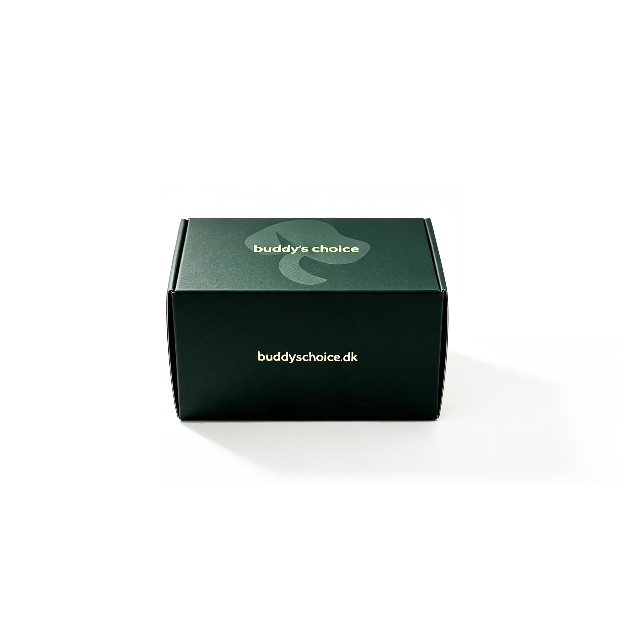
Vibrant custom packaging does more than hold a product; it speaks before anyone reads a word. When color psychology meets shelf appeal, a deep forest green signals calm and organic quality while a punchy coral demands attention from across the aisle. The right palette turns a box into a split-second decision maker. That visual pull gets stronger when the artwork feels hand-drawn rather than pulled from a tired stock library. Imperfect lines, custom lettering, and intentional texture give a brand the warmth of something made by people, not mass-produced. But beauty means little if the box arrives dented, so the cardboard itself must take a beating through shipping, stacking, and rough handling without losing its crisp edges.
Finishing choices create the next layer of persuasion. A soft-touch matte with a raised gloss logo invites fingers to linger, while metallic ink catches light and suggests something precious inside. These touches do not have to harm the planet. Recycled board can still feel thick and luxurious when paired with rich, low-VOC inks—eco luxe is no longer a compromise. Finally, the unboxing ritual matters as much as the first glance. A magnetic closure, a whisper-quiet lift, a printed inner flap with a small note or pattern turns a routine opening into a moment worth sharing. When all these elements work together, a professional color box stops being a container and becomes the reason a buyer remembers your product long after the tape is cut.
Contact Us
Contact Person: Tan Xiang
Email: [email protected]
Tel/WhatsApp: 8613798906863
Website: https://www.dgkjzx.com