

Bulk ADA Sign Material: Smart Solutions for Compliance and Durability
2026-07-07
Meeting ADA signage standards doesn’t have to mean compromising on durability—or your budget. Whether you’re managing a sprawling hospital campus or a multi-story office complex, sourcing bulk sign materials that consistently deliver compliance and long-term performance is trickier than it seems. That’s where LYSHIRE changes the equation, rethinking what a smart material solution can do before a single sign even reaches the wall.
What Really Counts as ADA-Compliant Sign Material?
When you start looking into ADA signage, it’s easy to get lost in a maze of fonts, finishes, and mounting heights. But the material itself carries just as much weight as the design. Tactile letters and Braille need a solid, non-glare substrate that can stand up to heavy use without fading or warping. Common choices include acrylic, photopolymer, and layered plastics that offer high contrast between text and background. The key is durability—if a sign scratches, peels, or loses its Braille dots over time, it fails both practically and legally.
Beyond the substrate, color contrast and matte finish are non-negotiable. Glossy materials create reflections that make text illegible for people with low vision, instantly violating the standards. Many specifiers turn to engraving stock with a matte top layer and a contrasting core, so letters stay crisp even after years of cleaning. There’s also a move toward sustainable options like recycled PETG, which matches the performance of virgin plastics while meeting stricter environmental codes—proving compliance and sustainability can work hand in hand.
Don’t overlook the Braille layer itself. True compliance means using domed, Grade 2 Braille that sits slightly raised from the sign face, manufactured through raster bead or photopolymer processes rather than simply embossing the substrate. This ensures the dots meet the exact diameter, spacing, and height mandates. In practice, a material that seems perfect on paper can still fail if the Braille isn’t produced with precision. That’s why so many fabricators rely on photopolymer signs—the one-piece, seamless construction eliminates delamination risks, making them a dependable choice for high-traffic environments.
Why Bulk Orders Unlock Hidden Savings and Consistency
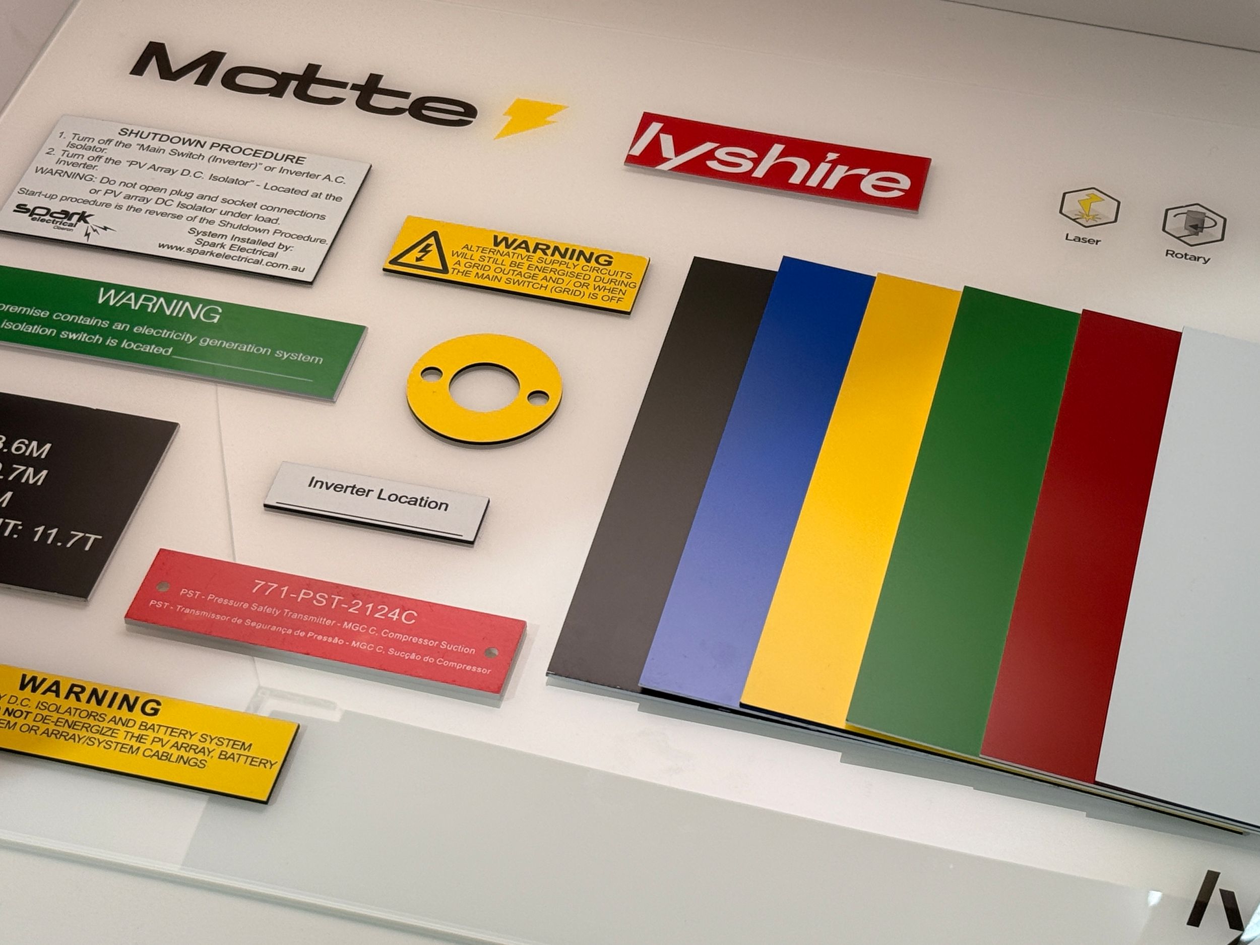
There's a quiet efficiency that comes with placing larger orders—one that goes beyond the obvious price break. When you commit to buying in bulk, suppliers can streamline their production runs, cut down on setup costs, and pass those savings directly to you. It's not just about getting a discount per unit; it's about reducing the countless small, almost invisible expenses that bleed from your budget with piecemeal purchasing. Think fewer invoices to process, less time spent on reordering, and a drastic drop in shipping fees when you consolidate shipments. These savings are easy to overlook if you're fixated solely on the sticker price, but they add up fast, turning a simple bulk decision into a powerful financial lever.
Beyond the numbers, there's a consistency that bulk ordering naturally enforces. By sourcing a larger volume from a single lot or production cycle, you're effectively locking in a uniform product. Whether it's raw materials, packaging, or finished goods, the slight variations that creep in from multiple small batches simply disappear. The color matches every time, the texture stays the same, and the performance remains predictable. This is the kind of reliability that keeps your own production humming without unexpected hiccups. It's like setting a steady rhythm for your supply chain, so you can stop worrying about subtle shifts in quality and focus on the bigger picture.
There's also a hidden relationship benefit that's rarely talked about. When you're a consistent bulk buyer, you're no longer just another order in the queue—you become a priority. Suppliers tend to go the extra mile for clients who help them plan their own inventory and capacity. You might get first dibs on fresh stock, faster turnaround on custom requests, or a dedicated contact who actually understands your needs. Over time, this partnership creates a feedback loop of trust and efficiency. Orders flow more smoothly, problems get solved before they escalate, and you find yourself spending less energy managing transactions and more time growing your business.
Picking Substrates That Outlast Weather, Fingers, and Time
When you're choosing a substrate for outdoor graphics, think beyond the spec sheet. Sure, the datasheet might promise five years of durability, but real life throws curveballs—acid rain, salt spray, constant UV bake, and the occasional graffiti artist. We’ve seen polycarbonate blends delaminate after two seasons, while certain aluminum composites just keep their cool. The secret often lies in the bonding layers and the coating’s ability to self-heal micro-scratches. Look for substrates that don’t just resist weather but age gracefully, developing a patina instead of peeling like cheap wallpaper.
Touch is a slow-motion disaster that nobody budgets for. Think of a public touchscreen kiosk or a trade show display—thousands of greasy fingertips, nails tapping, rings scraping. Regular acrylic turns foggy and scratched within months, becoming a blurry mess. That’s where chemically strengthened glass or nano-coated PET substrates step in. They aren’t just harder to scratch; they actively repel fingerprint oils and are a breeze to clean with just a microfiber cloth. The real test is that moment after a cleaning crew uses the wrong solvent—your substrate should shrug it off without hazing. It’s the difference between a display that looks tired after one event and one that remains crisp for years.
Time is the ultimate stress test. A substrate might survive a blast of weather or a thousand touches, but can it handle both, plus humidity swings and decades of temperature cycling? We’ve tested panels on rooftop equipment that went through -30°F winters and 140°F summers, only to find the ink adhesion stronger than the substrate itself. The winners in these long-haul scenarios often have a slightly roughened surface profile, which provides mechanical bite, combined with flexible polymer coatings that expand and contract without cracking. The added bonus? These materials tend to hold color vibrancy longer because the pigment isn’t trapped in a hardening shell that eventually fractures. It’s not about picking the toughest material on day one; it’s about choosing the one that’s still performing on day one thousand.
Tactile and Braille Done Right Without the Fluff
Tactile signs and Braille aren’t extras you tack on at the end to meet a checklist. They’re part of a genuinely accessible space. When done right, they blend in so naturally that most people hardly notice them—until someone relies on them. The key is keeping it simple: clear, durable markings placed exactly where people expect them, without unnecessary decoration or confusion.
Quality matters more than quantity. A few well-made Braille labels and raised characters beat an entire wall of poorly spaced dots and pixelated text. Choose materials that withstand constant touch without wearing smooth. Stick to consistent mounting heights and logical locations—next to doors, on handrails, at elevator controls. Standards exist for a reason, but real-world testing with actual users reveals the gaps that regulations can’t predict.
Strip away the fancy marketing talk. No one needs “revolutionary” tactile solutions or “next-gen” Braille. What they need is information that’s reliably there when fingertips go searching—sharp, readable, and silent. Good accessibility doesn’t shout; it simply works. And that’s the whole point.
Design Tricks That Keep Signs Accessible and On-Brand
Balancing brand personality with inclusive design often comes down to a handful of quiet moves that most people never notice. Instead of sacrificing style for legibility, clever designers lean into high-contrast typography that stays true to the brand’s visual voice. A serif or display typeface might feel essential to a luxury hotel’s identity, but when paired with a clean sans-serif for critical wayfinding text, both personality and clarity coexist. The trick isn’t just picking two fonts—it’s matching x-heights and stroke weights so the shift feels seamless, not jarring.
Color is another place where accessibility and branding collide, and the best solutions often break the obvious rules. You can hold onto a brand’s signature palette by using its boldest hue for directional symbols or room numbers while dialing back saturation on large background areas to reduce glare. A university signage system, for example, might use a muted version of its bright crimson across panels and reserve the full-intensity red solely for the arrow that points you to the admissions office. This layered approach keeps the environment unmistakably on-brand without overwhelming the eye or compromising readability for visitors with low vision.
Tactile and spatial cues do the heavy lifting when visual branding risks falling short. Engraved letterforms painted in a matte finish provide both a subtle brand texture and a readable surface under varied lighting. Placing signs at consistent heights and mounting them on contrasting architectural elements—like a dark beam against a white wall—gives people a predictable place to look without adding visual clutter. These decisions never scream for attention, but they quietly make a space work for everyone, proving that accessibility doesn’t dilute a brand; it sharpens it.
Avoiding Common Failures in High-Traffic and Outdoor Spots
Placing equipment in busy or outdoor areas often leads to problems that are surprisingly easy to overlook. One of the most frequent issues is physical damage from accidental bumps, kicked cables, or weather exposure. In high-traffic zones, a poorly positioned device can become a tripping hazard or get knocked over regularly, cutting its lifespan short. Outdoors, even gear labeled “weather-resistant” can fail when constantly exposed to direct sunlight, temperature swings, or moisture build-up inside enclosures. A simple fix is to mount hardware above foot level and use protective housing rated for the specific environment—not just any off-the-shelf cover. Also, pay attention to cable routing: use tough conduits and keep connectors sealed to avoid corrosion or disconnections that are hard to trace later.
Another silent killer in public or exposed installations is ignoring the impact of dust, insects, and debris. Ventilation openings can get clogged faster than expected, causing overheating even in moderate weather. Insects often nest inside warm electronics, shorting components or attracting larger pests that chew wiring. A regular cleaning schedule and fine-mesh screens over vents can prevent most of these intrusions. Similarly, digital signage or kiosks in direct sun suffer from screen glare and heat buildup, making them unreadable and prone to early burnout. Anti-glare films and active cooling solutions—like small fans or heat sinks—are worth the extra cost when replacing a unit means losing both money and visitor trust.
Lastly, don’t underestimate how quickly user behavior and outdoor conditions can shift. A spot that seems quiet today might become a skateboarding shortcut next week, or a shaded corner could turn into a sun trap after seasonal tree trimming. Power supplies left exposed get unplugged by cleaning crews or vandalized just for fun. The key is to design each setup as if it will face the worst-case scenario, with lockable cabinets, tamper-proof fasteners, and enough cable slack to survive a strong yank. Before finalizing any placement, observe the area at different times and talk to maintenance staff—they often know about hidden risks no blueprint reveals.
FAQ
Bulk ADA sign material is ideal for large-scale projects because it reduces per-unit costs while maintaining the tactile and visual standards required by the ADA. It simplifies inventory management and ensures consistent quality across all signs.
The material is engineered to resist scratching, fading, and warping, even in high-traffic environments. It can withstand frequent cleaning and physical contact, ensuring the raised characters and braille remain intact for years.
Absolutely. While compliance is the priority, the substrate and color layers can be tailored to align with your brand palette and design. You can achieve a cohesive look without sacrificing readability or tactile requirements.
The material includes integral non-glare surfaces, high-contrast color cores for raised characters, and a precise braille cell depth. It meets ADA Standards for Accessible Design, specifically regarding finish, contrast, and dimensional requirements.
Yes, the material is lightweight and can be cut and routed with standard sign-making tools. It comes with detailed specifications for mounting, and many suppliers offer pre-drilled templates or adhesive options that speed up installation.
Unlike traditional engraved signs that may need paint-filling and multiple steps, bulk ADA material provides a solid-color core that reveals the contrast when routed. This speeds up production and gives a cleaner, more durable finish with UV stability.
Many bulk ADA sign materials are manufactured with recycled content and are fully recyclable at end of life. The production process often uses less energy than metal or acrylic alternatives, and the longevity reduces replacement frequency.
While primarily designed for interior use, certain grades of the material are UV-stabilized and moisture-resistant, making them suitable for covered exterior areas. Always check the manufacturer’s specifications for outdoor durability to ensure lasting performance.
Conclusion
ADA compliance starts with material choices that meet federal guidelines for raised characters and Braille, but not all plastics or metals pass the test in daily use. Bulk purchasing is often overlooked as a strategic move—it stabilizes pricing and ensures that every sign on your property shares the same substrate color, thickness, and finish. That uniformity simplifies installation and routine updates. Truly compliant material goes beyond the surface; it must retain its tactile and visual integrity after years of finger contact, harsh cleaners, and weather swings. Materials like UV-resistant acrylic or solid-core photopolymer with a durable top layer stand up to constant handling, janitorial chemicals, and changing climates without warping or losing tactile clarity. Choosing these substrates in bulk keeps your entire facility consistently compliant while cutting long-term replacement costs.
Accessible design doesn’t have to clash with branding. Clean, sans-serif fonts, adequate spacing, and a matte background reduce glare while keeping the message crisp. Braille that’s smooth and rounded—not sharp or flimsy—comes from precision manufacturing rather than quick stamping. Outdoor and high-traffic settings demand extra resilience: freeze-thaw cycles, UV exposure, and heavy wear can quickly degrade lesser signs. Common failures like peeling Braille, faded ink, and warped edges are preventable when you avoid thin laminates and choose solid substrates with integrated color. Regular maintenance shouldn’t damage the tactile features; that’s why moisture- and abrasion-resistant materials matter. Pairing smart design with durable substrates and consistent bulk ordering gives you signs that remain compliant, readable, and on-brand long after installation.
Contact Us
Contact Person: Tina Hou
Email: [email protected]
Tel/WhatsApp: +86 17816238685
Website: https://www.lyshire.com